Showing posts with label beginning watercolor. Show all posts

Friday, September 09, 2011

To Simplify— Focus On Design

Design principles must guide every thought and mood while your subject is being smelled, tasted, touched, listened to and looked at. You paint with all 5 senses. You must be emotionally and sensually involved with your subject. —Edgar Whitney

Every time I hear someone suggest simplifying a painting, my mind goes numb. The simplify instruction is so commonly used by instructors, it's almost a mantra. It shouldn't be. It won't make you a better painter. Simplify! What does that mean!? Sim•pli•fy: make (something) simpler or easier to do or understand. Try to follow such a broad, vague instruction without knowledge of design and you'll put us all to sleep with your paintings. So what to do when you encounter this instruction? Dust off your design tools! The elements and principles of design will show you how, when, where and most importantly why to simplify. So wake up those brain cells, peeps! Get thee to designing your compositions.

We make art to visually convey our unique personal perspective. To identify that perspective, one needs to be able to call up feelings and emotions relating to the subject of the painting and express them visually. This is where your understanding of the elements and principles of design can aid and develop artistic expression. It's the interplay of design elements and principles that guides the viewers' attention to the expressive meaning of your work. Simplicity per se doesn't function well on it's own. It shows up best when partnered with detail. You need them both or you'll end up with a painting that's too uniform— in other words, a sleeper. So how will simplicity and detail interact in your composition? Will you use contrast, create rhythm, balance, repetition or harmony? Or will one so dominate that the overall unity of the composition will be destroyed?

There are so many dimensions to a painting— far more than the obvious two dimensions of the paper or canvas. Design tools open up all those other dimensions— emotional dimensions that are so difficult to express in words are magically unlocked using pattern, line, shape, value, color or size. The way we use these elements creates an emotional resonance with the viewer. The design principles themselves seem to have an emotional resonance.

As the foundation and building blocks of good art, design is a topic that deserves ongoing study and discussion. My purpose here is to point out that simplification happens very naturally when working with design principles. Simplicity is not the first law of painting. Without design as a guide, simplifying by rote dulls creative expression. Shift your focus to design and simplification will take of itself.

Sunday, October 18, 2009

The Heart of Watercolor– Luminosity

Our natural inclination is to mix color on the palette or, easier yet, use premixed color straight from the tube. Color is certainly more predictable that way. But the beauty of watercolor— luminosity, is best revealed when color is mixed on the paper. This is where watercolor quite literally shines! The transparent nature of watercolor allows light to pass through and bounce off the white of the paper. This is not a medium for the heavy handed. Those loose, delicate washes of color appear effortless, yet they require much of the artist wielding the brush. Watercolor practice will develop patience and the ability to focus. It will fine-tune all of your senses. And, it can show us how to live wide awake and paint with that vivid awareness. There probably will be moments of discouragement, but don't fret! The mingling of water, pigment and artist on the paper is a truly sublime experience that makes any momentary discouragement pale by comparison. Set aside desires for predictable outcomes and formulas to get them. Watercolor, like life, is full of surprises. It is the unexpected that makes it so endlessly captivating. Though modern pigments are crafted for longevity, the luminosity they impart has a decidedly ephemeral feel. I love that we mix earth and water as we paint and express what is most important to us. If you pause to contemplate the life of the colors on your palette, you see that you hold the whole universe on your brush.

When you made the chart of your primary colors, you learned how to deepen a color by glazing, or layering one stroke of color over another. The palette chart documented your pigments showing their hue, transparency and staining qualities. Now we'll use the same glazing technique to create new colors. Lay down a good sized stroke of each primary color.
We're going to mix secondary colors— orange, green, purple— by glazing with your three primaries. Are those strokes dry yet? Check with the back of your fingers. (The oil from the skin on your fingertips can transfer to your paper and create paint-resistant spots, so use the back of your fingers.) Now, paint a stroke of yellow over half of the dry red stroke. Where the two colors layer over one and other, you should see a nice glowing orange. Next, paint a stroke of blue over part of your yellow swatch. You should see green where they overlap. And last, paint a stroke of red over part of your blue swatch. Voilá! Purple!

Glazing is one of the most important watercolor techniques you can develop. It's key to building luminosity and depth. Of course you can also mix the secondary colors right on your palette— red + yellow for orange, yellow + blue for green and blue + red for purple. Mix the secondaries and then paint swatches of them on your paper to compare with your glazed secondaries. How do they look? The glazed secondaries should have a unique glow as one color shines through the other. Mixed colors have a more solid appearance depending on the ratio of water used.

You may have noticed new hues appearing on your palette as pigments dripped and bled and mingled creating whole arrays of colors. Let's do this on watercolor paper. This time lay down strokes of clear water and drop brush loads of primary colors into the watery strokes. Let red and yellow mingle, red and blue, and yellow and blue. The water and pigment move by themselves, attracting and repelling depending on the characteristics of each pigment. If you get antsy, you can help them along by tilting the paper, adding more pigment or water, or by removing water or pigment with a thirsty, dry brush. You have just experimented with the wet-in-wet technique. It's a beautiful, loosely controlled technique that can loosen one's penchant for studiously building form. And did I say how deliciously fun it is!? Notice the glowing quality of these orange, purple and green colors that appears almost magically, when we pause and allow the colors to mingle.

So there you have a few ways to experiment with color mixing. Are you going to try them out with a little painting? How will you use the natural luminosity of watercolor to express what's important to you?

Thursday, September 24, 2009

When It Comes To Watercolor— Less Is More

You've heard the adage less is more. Well, I do like this one! If you've been painting a while, you know how tempting all those little tubes of paint can be. They fit so perfectly in the hand, come packaged so neatly in those sweet little boxes— and the contents, oh so brilliant! Color is mesmerizing. It's easy to spend hours (not to mention dollars) pouring over color swatches in art material catalogs. But stop! Listen up now. Less really is more. For beginners in watercolor, the concept of less is more pays huge dividends down the road. Working with a limited palette is not only economical, it affords you the opportunity to learn much more about color and the essence of watercolor painting— transparency. Luscious layers of glowing color!

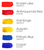
Warm & Cool ColorsStarting with a palette of primary colors— red, yellow and blue— you'll soon see that these three little colors are capable of producing an infinite variety of hues. Here are some primaries from my palette. If you read my materials list from an earlier post, I suggest using a split primary palette— two reds, two yellows and two blues. These three extra primary colors will add another dimension to your palette. One set of primary colors is considered warm, and one set is considered cool. Warm and cool colors are not easy to discern and are somewhat subjective, never the less I recommend giving it some attention from the very beginning of your painting practice. For now simply notice color in your world. Is it warm or cool? You are beginning to develop your senses, the most valuable tool in your box, and it's free!

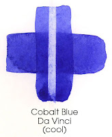
Cobalt Blue (Cool)No matter how many colors in your paint box, you may find it helpful to chart your palette. Developing a chart of the colors on your palette will help you understand some unique characteristics of your pigments. Do they stain the paper or do they just sit on top? Are they transparent or opaque? While learning the quirks and personalities of each pigment on your palette, you’ll create helpful reference material for future artwork. Layering two simple strokes one crossing over the other, you learn about the transparency or opaqueness of your pigments. (Remember to let the first stroke dry before you add your cross stroke.) You can learn something about the staining quality of your pigments by gently rubbing the dry paint on the paper with a damp sponge, or simply applying a brush stroke of clean water to a dry painted area and blotting up the water and loosened pigment with a paper towel. In watercolor parlance, this is called lifting. I love this effect! You'll find some of your pigments lift from the paper easily, while others stain and no amount of scrubbing will remove the color, short of making a hole in the paper. So, unless you like holes in your paintings, be gentle!

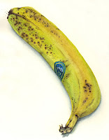
My lunch_ a bananaOh, and remember to note on your chart the name of each color and the brand of paint you are using. You'll be glad to have this information later, when you slip off the less-is-more wagon, or you simply run out of paint and need to buy more pigment.
Okay. The chart is done. You've learned some basic information about each of your pigments, and also about your paper and brush. I think it's time to paint something! Don't you? Pick a simple object to paint keeping in mind what you have learned about how layers of paint deepen the color. How about painting lunch?

Monday, September 21, 2009

Getting Started In Watercolor

Here is a list of basic materials to get you started in watercolor. Art materials are expensive. No doubt about it. So, I'm suggesting some good quality materials that are less expensive than most. You may substitute materials of your own choosing, though it will be helpful down the road to maintain the split palette of primary colors— 3 cool primary colors and 3 warm primary colors. It's amazing how much fun you can have with just three colors— red, yellow and blue! 

You'll notice the first thing on my list of materials is space. It is essential for beginner painters to have dedicated space to work in. Create a work space that is yours and yours alone! It can be as simple as a card table in a corner of your kitchen, as long as that space remains dedicated to painting and you can leave your projects there without losing track of them.
 
Take care of your brushes, paints and other materials as though they were your own eyes. Periodically wash your brushes in warm, soapy water, clean your palette with a damp sponge, wipe the lip of each tube of paint before capping it. Pay attention to how you handle and store your materials. It can't hurt to give thanks for all living beings— earth, human, animal— who have brought these art materials into your life.


Materials List

Space— Create a space for yourself that is dedicated to painting

Pigments— Van Gogh Watercolors 10 ml tubes
    Reds: (cool) Quinacridone Red and (warm) Permanent Red Lite
    Yellows: (cool) Permanent Lemon Yellow and (warm) Gamboge
    Blues: (cool) Cobalt Blue and (warm) Phthalo Blue

Palette— Cheap Joe’s Original Palette 

(12-1/2" x 9-1/2" with 17 color wells & lid)

Brushes— Cheap Joe’s Starving Artist Brushes
    Flats: 1" and 1/2"
    Rounds: #6, #8 and #12

Paper— Winsor & Newton Watercolor Paper
    5 sheet pack of 140# Cold Press 22" x 30"

Paper Support— Gator Board- 16" x 23"

Miscellaneous—
    Magic Rub eraser                                         sketch book
    pencils- 2B                                                     natural sponge
    water container (ice cream bucket?)        hair dryer
    spray bottle                                                    masking tape
    paper towels & Kleenex                               ruler
    black permanent waterproof marker       old toothbrush

Suppliers
    Cheap Joe’s Art Stuff 1-800-227-2788 or www.cheapjoes.com
    Art Materials Inc. 612-872-8088
    Daniel Smith 1-800-426-6740 or www.danielsmith.com
    Dick Blick 612-593-5588
    Penco 612-333-3330
    Wet Paint 651-689-6431

Kristine Fretheim.com is Live

My new web site, KristineFretheim.com , is up and I hope you all will take a look and let me know what you think. Posts from Watercolor Haik...