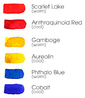
 Starting with a palette of primary colors— red, yellow and blue— you'll soon see that these three little colors are capable of producing an infinite variety of hues. Here are some primaries from my palette. If you read my materials list from an earlier post, I suggest using a split primary palette— two reds, two yellows and two blues. These three extra primary colors will add another dimension to your palette. One set of primary colors is considered warm, and one set is considered cool. Warm and cool colors are not easy to discern and are somewhat subjective, never the less I recommend giving it some attention from the very beginning of your painting practice. For now simply notice color in your world. Is it warm or cool? You are beginning to develop your senses, the most valuable tool in your box, and it's free!
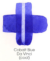
 No matter how many colors in your paint box, you may find it helpful to chart your palette. Developing a chart of the colors on your palette will help you understand some unique characteristics of your pigments. Do they stain the paper or do they just sit on top? Are they transparent or opaque? While learning the quirks and personalities of each pigment on your palette, you’ll create helpful reference material for future artwork. Layering two simple strokes one crossing over the other, you learn about the transparency or opaqueness of your pigments. (Remember to let the first stroke dry before you add your cross stroke.) You can learn something about the staining quality of your pigments by gently rubbing the dry paint on the paper with a damp sponge, or simply applying a brush stroke of clean water to a dry painted area and blotting up the water and loosened pigment with a paper towel. In watercolor parlance, this is called lifting. I love this effect! You'll find some of your pigments lift from the paper easily, while others stain and no amount of scrubbing will remove the color, short of making a hole in the paper. So, unless you like holes in your paintings, be gentle!
  Oh, and remember to note on your chart the name of each color and the brand of paint you are using. You'll be glad to have this information later, when you slip off the less-is-more wagon, or you simply run out of paint and need to buy more pigment.
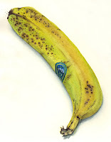
 Okay. The chart is done. You've learned some basic information about each of your pigments, and also about your paper and brush. I think it's time to paint something! Don't you? Pick a simple object to paint keeping in mind what you have learned about how layers of paint deepen the color. How about painting lunch?


No comments:
Post a Comment